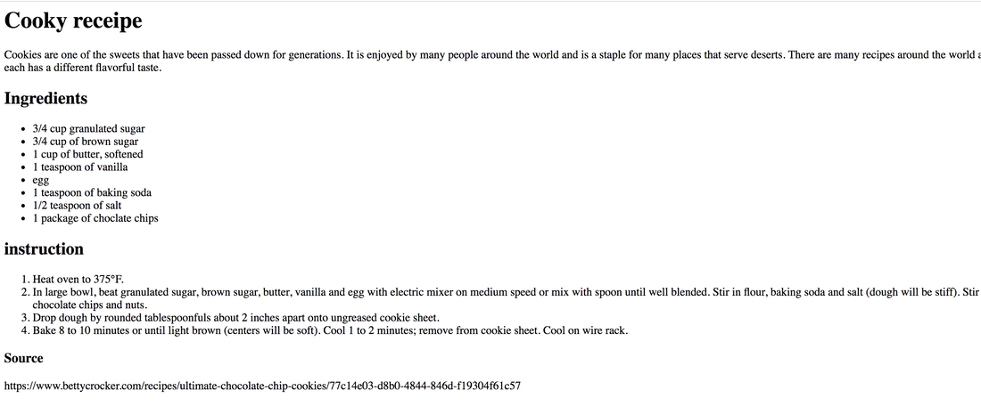
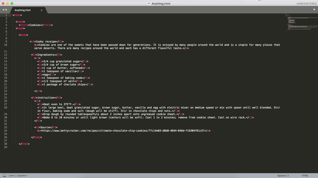
  We were asked to make a list of anything, so I chose cookies. I looked at the website for making cookies and wrote it down in sublime text, making an ordered text and unordered text.
0 Comments
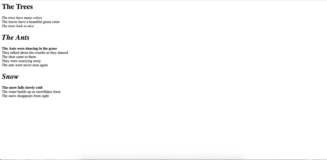 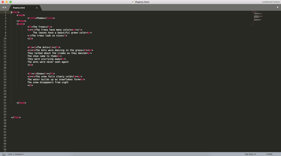 In this assignment we were asked to make two different types of poems. We were asked to them into sublime text. I had to use the new tags that we learned such as a bold tag, and line break tag, but overall I learned a lot that I didn't know from teal text.
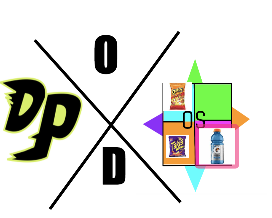
My first web page  The code to make the web page  For this portion of the logo design, we were asked to make 3 variations of each of our 3 logos. The variations needed to be something that was different from our original design, yet kept some of the same components. The most frustrating part of this process was thinking about the ideas. I am not really a creative person, so it was hard to make designs that looked different from my original design. After trying multiple times I finally created 3 designs for each of the original designs that I thought looked great. My favorite part of this process was using tools in gravit that I haven't used before. This includes the pen-tool which actually felt like a real pen. Something that I learned from this whole entire experience is that you can create an amazing design, only using a few components. 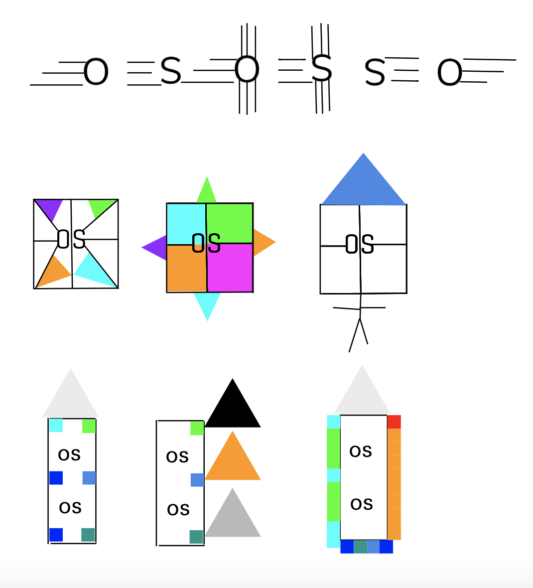 The name of the brand is OS. The purpose of the brand is to be helpful in any way possible no matter what the problem is. The logo represents the brand because it is a simple logo that can easily be copied, like the brand represents. This logo is my favorite and I chose it because it is something simple that pops up. Even though the logo is only composed of a few lines and shapes, it is still something that looks cool, colorful, and neat. 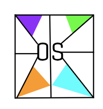 The process of making my artwork was very hard. I do not consider myself very artistic so it was hard to be creative and come up with five different designs for my artwork. After I tried a multitude of times I was able to come up with three that I enjoyed. The three designs that I liked stemmed from the word quick, thinker, and building. These words represented me because I think that I am quick, think very deeply and I love buildings. 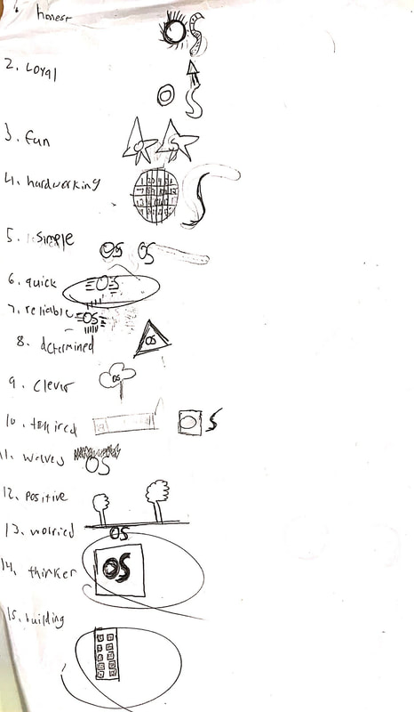 For this assignment we were asked to use adobe color in order to create 4 different color pallets each having 5 different colors. there were 4 different palates that we needed to create which were Monochromatic, Analogues, Complementary, and Triadic. Monochromatic describes a color scheme where there is one color and multitude of saturation and brightness levels. Analogues describes a color scheme where the colors are close to each-other on the color wheel. Complementary is a mix of colors that put hues fro opposite sides of the color wheels together. Finally, Triad describes three colors that are spaced evenly around the color wheel. I find Monochromatic the most interesting because it creates a multitude of colors only using one hue. 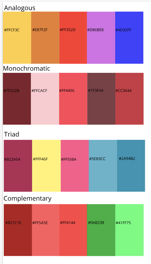 In this assignment I was asked use color theory in order to make 15 different colors and right their different values of Red, Blue, Green and make them visually appealing. Red, Blue, and green are the primary colors when using the computer. Furthermore, we needed to display the colors using hex code. The challenges that I faced were trying to make my assignment visually appealing. It was hard to make each and every single shape look perfect and neat and is one of the things that I struggle to do in any of these assignments. To over come these challenges I asked for help and was provided with the answer. However, the first time was not right. I had to try multiple times in order to fully perfect the assignment and get over the first step. In my artwork I am proud of the almost perfect alignment from text box to text box and start to star. In Gravit.io I used the alignment button, the magnifying glass, and the shapes. The inspiration behind my work was twinkle twinkle little star. I was just sitting on my desk listening to music an on day this song came up. This was the inspiration behind my technology work. 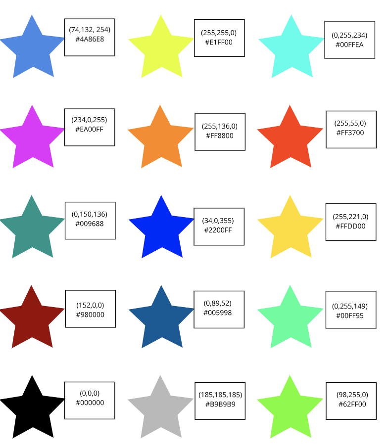 Typography is a "visual component of written words." The quote "each font has a personality and a purpose" means that a font effects so much of the graphic design. For example, when we use something like Comic Sans it looks in formal and child like, however when we use that on something like an ambulance it changed the whole entire aspect of the design. There are 5 different types of fonts for example, Serif, Sans Serif, Monospaced, Script/Handwritten, Novelty. Serif sans looks like it has feets and are used in print. Sans Serif do not have feet and are great for headlines and titles. Mono spaced each letter takes up the same amount of space does not work well for large blocks of texts. Script and handwritten are hard to read and looks like cursive writing. Finally Novelty looks unique making it a good attention getter. All of the fonts fall under one of these categories and all of them create a different kind of aspect to the design that you are creating which is why you need to choose carefully which one of the fonts that you choose. Typeface comparisonDuring the typeface comparison activity we were told to choose five different fonts and make them under the five different categories we learned and make them look interesting. When I did this activity I made a word that was meaningful to me and changed it. For example, I made the word penguin different using different colors and different fonts 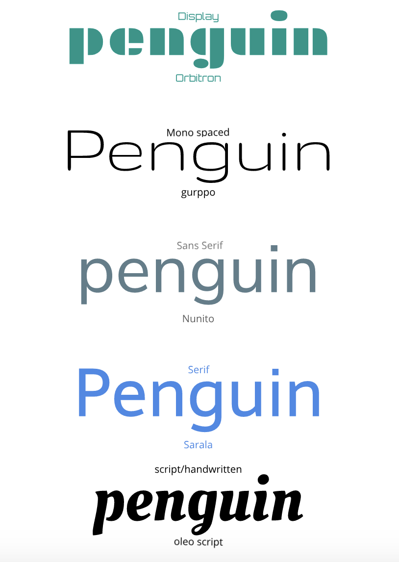 word portraitDuring, the word portrait activity we used different fonts and said one thing that it reminded of us. For example, for an open sans font I wrote that it reminded me of a something computer written and then I wrote that it did not remind me of something that was hand written. Throughout this assignment it taught me that neatness was important. Sure, placing and writing words is easy but aligning them perfectly is hard 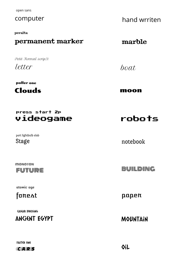 This drawing represents a stranded boat that is trying to cross the water. The blue represents water and the crack between them represents a wave. The wave is pushing the boat to the island that is nearby. Throughout this assignment I have learned to make different shapes using code, such as a circle or a rectangle. Furthermore, I have learned how to change their sizes and their colors. For example, (100,300,200,300). Finally I have learned how to problem solve while making my drawing with code. 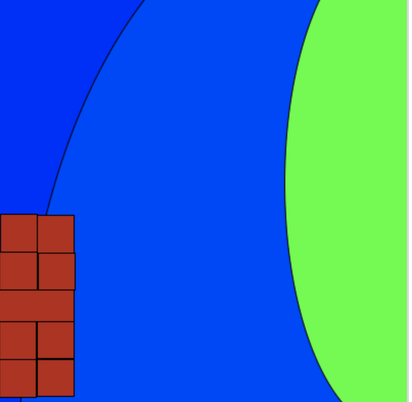 background(28, 20, 255);
//building //window fill(255, 208, 0); //darkness fill(28, 58, 255); ellipse(322,424,600,1049); //color fill(0, 255, 34); ellipse(383,182,205, 481); fill(184, 39, 22); rect(0,285,74,38); rect(38,213,36,37); rect(2,212,36,37); rect(1,249,37,37); rect(1,317,36,37); rect(1,354,36,37); rect(39,250,36,36); rect(38,317,36,36); rect(38,354,36,36); |
Archives
October 2019
Categories This work is licensed under a Creative Commons Attribution-NonCommercial-NoDerivatives 4.0 International License. |
 RSS Feed
