|
Typography is a "visual component of written words." The quote "each font has a personality and a purpose" means that a font effects so much of the graphic design. For example, when we use something like Comic Sans it looks in formal and child like, however when we use that on something like an ambulance it changed the whole entire aspect of the design. There are 5 different types of fonts for example, Serif, Sans Serif, Monospaced, Script/Handwritten, Novelty. Serif sans looks like it has feets and are used in print. Sans Serif do not have feet and are great for headlines and titles. Mono spaced each letter takes up the same amount of space does not work well for large blocks of texts. Script and handwritten are hard to read and looks like cursive writing. Finally Novelty looks unique making it a good attention getter. All of the fonts fall under one of these categories and all of them create a different kind of aspect to the design that you are creating which is why you need to choose carefully which one of the fonts that you choose. Typeface comparisonDuring the typeface comparison activity we were told to choose five different fonts and make them under the five different categories we learned and make them look interesting. When I did this activity I made a word that was meaningful to me and changed it. For example, I made the word penguin different using different colors and different fonts 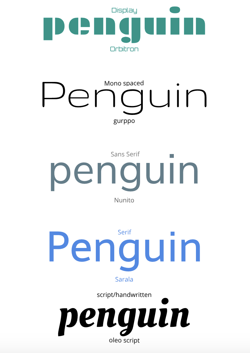 word portraitDuring, the word portrait activity we used different fonts and said one thing that it reminded of us. For example, for an open sans font I wrote that it reminded me of a something computer written and then I wrote that it did not remind me of something that was hand written. Throughout this assignment it taught me that neatness was important. Sure, placing and writing words is easy but aligning them perfectly is hard 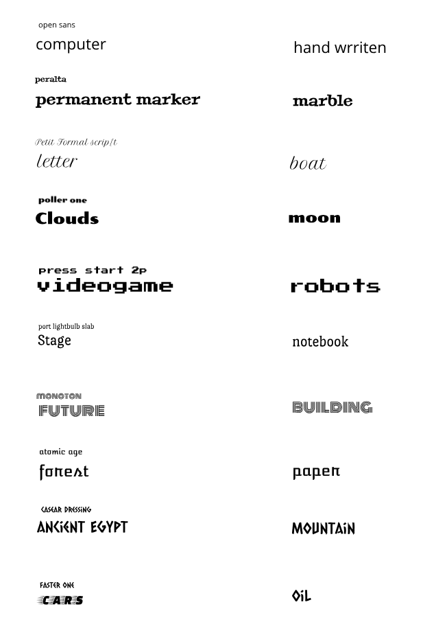
0 Comments
Leave a Reply. |
Archives
October 2019
Categories This work is licensed under a Creative Commons Attribution-NonCommercial-NoDerivatives 4.0 International License. |
 RSS Feed
