|
For this portion of the logo design, we were asked to make 3 variations of each of our 3 logos. The variations needed to be something that was different from our original design, yet kept some of the same components. The most frustrating part of this process was thinking about the ideas. I am not really a creative person, so it was hard to make designs that looked different from my original design. After trying multiple times I finally created 3 designs for each of the original designs that I thought looked great. My favorite part of this process was using tools in gravit that I haven't used before. This includes the pen-tool which actually felt like a real pen. Something that I learned from this whole entire experience is that you can create an amazing design, only using a few components. 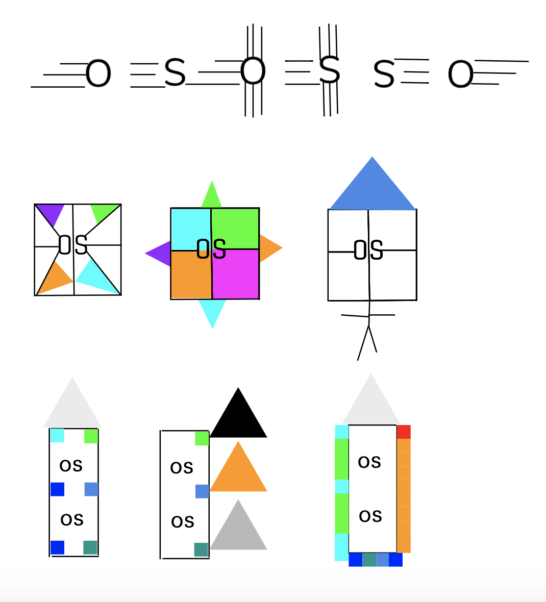 The name of the brand is OS. The purpose of the brand is to be helpful in any way possible no matter what the problem is. The logo represents the brand because it is a simple logo that can easily be copied, like the brand represents. This logo is my favorite and I chose it because it is something simple that pops up. Even though the logo is only composed of a few lines and shapes, it is still something that looks cool, colorful, and neat. 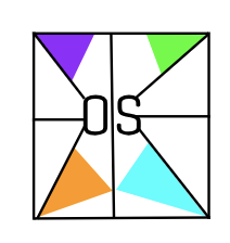
0 Comments
Leave a Reply. |
Archives
October 2019
Categories This work is licensed under a Creative Commons Attribution-NonCommercial-NoDerivatives 4.0 International License. |
 RSS Feed
